 Eloi
EloiOverview#
I wanted to explore what the Nova Echo website could feel like if the experience was designed around one question: Can a non-technical business owner quickly understand what this product actually does?
Nova Echo is a Voice AI platform built around business automation and AI-powered calling. There’s a lot to communicate, so I focused the redesign on making the product easier to understand while creating a clearer path from discovery to conversion.
This was an unsolicited concept redesign, based only on information publicly available on the existing website.
Making Voice AI Easier to Understand#
Voice AI can be difficult to communicate through text alone. Instead of relying entirely on feature descriptions, I introduced more visual ways to explain how AI agents could work.
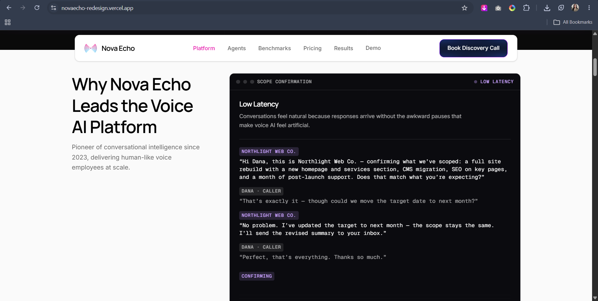
The redesign uses agent-focused sections, workflow visuals, and setup interfaces to give visitors a more concrete idea of what happens behind the scenes.
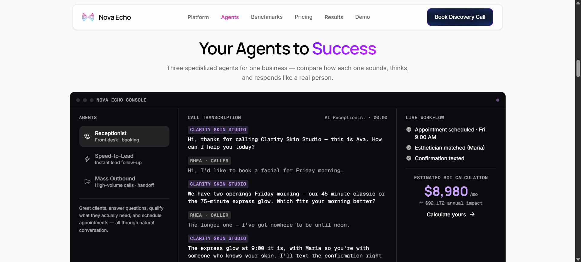
I also intentionally repeated some of the core concepts throughout the experience.
While this can make certain sections feel repetitive, the repetition is deliberate. I wanted users to encounter the same idea in different contexts so they could gradually build an understanding of how Voice AI fits into a business workflow.
From Features to Business Use Cases#
Rather than presenting Voice AI as a collection of technical capabilities, I structured the experience around specific business scenarios.
The AI agents are introduced through practical use cases, helping visitors understand not just what the technology can do, but where it can actually fit into their business.
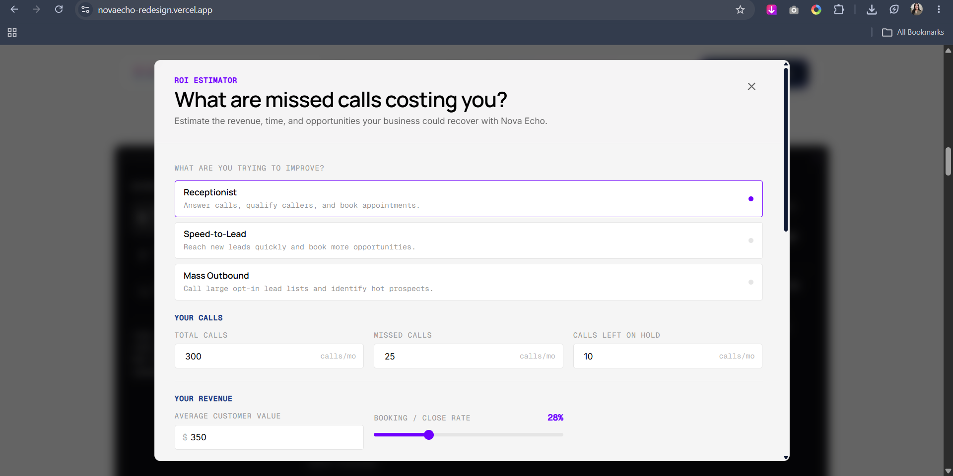
The existing ROI calculator was also redesigned as part of the overall experience.
Instead of treating it as a separate tool, I integrated it into the product story to help visitors connect automation with potential business impact.
Designing the Conversion Journey#
The rest of the page follows a more deliberate progression:
Product → Use cases → How it works → Benchmarks → Pricing → Results → CTA
Each section is intended to answer a question a potential customer might have before taking the next step.
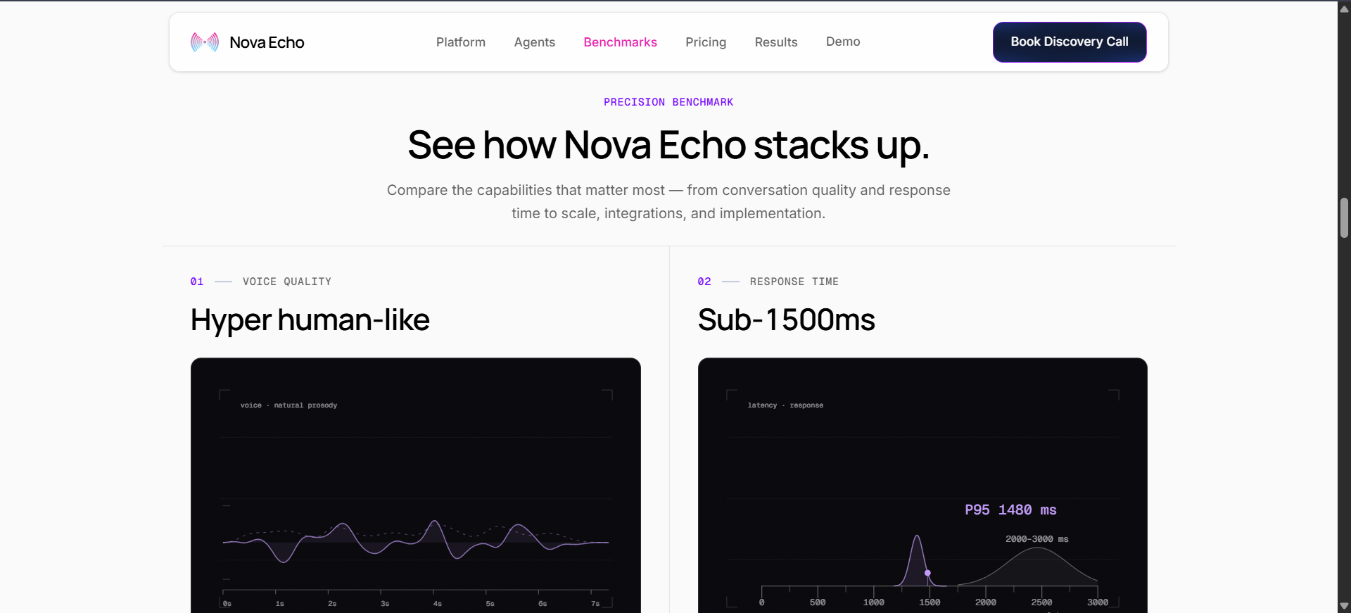
I also strengthened the visual hierarchy and introduced supporting sections for benchmarks, pricing, customer results, and other trust-building content so visitors have more context before reaching the final conversion points.
Building the Concept#
I built the redesign as a fully functional web experience using Next.js, Tailwind CSS, and Framer Motion.
The implementation was AI-assisted, with AI helping with parts of the coding and iteration process. The design direction, UX decisions, visual system, content structure, and overall concept were my own.
Because this was an unsolicited redesign, some of the UI, workflows, copy, and interactions are design explorations rather than confirmed Nova Echo functionality.
For the sample calls, I used text transcripts instead of voice recordings since I didn't have access to Nova Echo's actual AI voices.
The Result#
This project became an exercise in designing not just a website, but a clearer way to communicate a relatively complex AI product.
The goal wasn't to simply make Nova Echo look different.
It was to explore how its value could be made easier to understand, evaluate, and remember — especially for someone without a technical background.